I've been feeding with Annie's Pantry since July 2025. Same-day raw, BigPupTubs in the freezer, reorder when the stash runs out. I already liked them — enough to write them up in my raw dog food comparison earlier this year. They had me as a customer. What happened this week is why I'm writing again, and why they won me over.
I asked for something ordinary: a way to see how much I spend, month by month, without reconstructing it from an orders list. They built it, they checked what else I wanted, and they came back on WhatsApp the morning it went live.
Disclosure: I pay for every Annie's Pantry order. The shop link in this article is my referral link — same prices, and it supports the site.
What I actually asked for
On Sunday 8 November I sent them a WhatsApp. Could they add a dashboard, something easy, so I could see spend month by month?
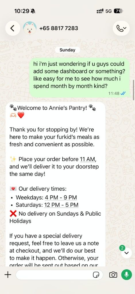
I had already found a date filter on the orders page and could pull a single month if I typed the start and end dates myself. It worked. It was also a chore, and the list itself is hard to scan — row after row, closer to a data export than a record of feeding two dogs. I told them a dashboard would just be easier to look at, and I framed it as feedback.
Monday morning they replied they were already working on a new app. The note was timely. They would pass it to the dev team.
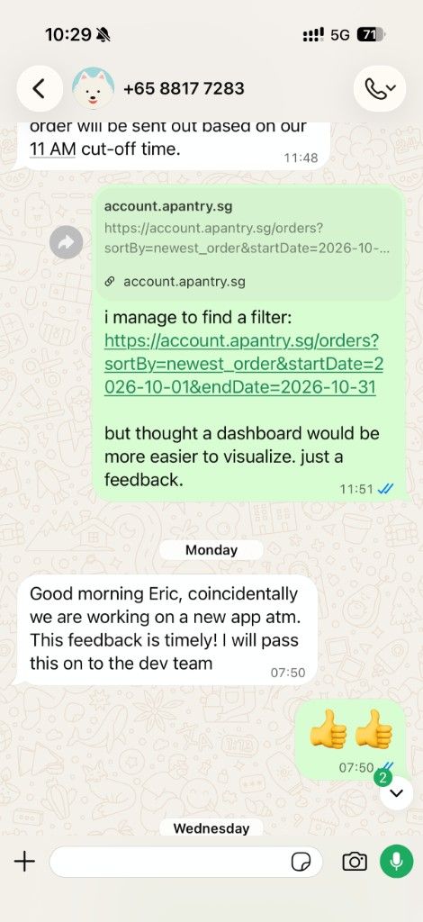
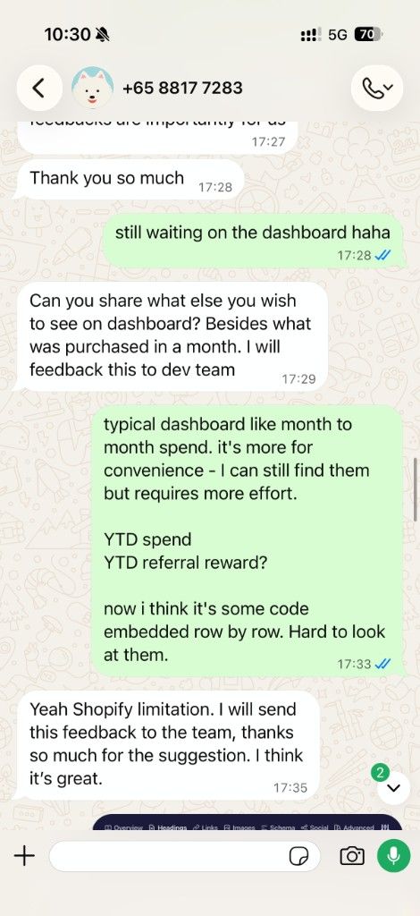
A few days later I was still half-joking that I was waiting on the dashboard. They asked what else I wanted to see, besides what I'd bought in a given month. I sent the short list I actually care about:
- Month-to-month spend
- Year-to-date spend
- Year-to-date referral reward
They clocked the orders page as a Shopify limitation, said the suggestion was a good one, and sent it on. Huge kudos to them for treating that like a real brief.
Then My Dashboard was live
On the morning of 13 November, their dev team asked me to take a look at My Dashboard. I asked if it was actually live. It was. Click the head icon on the account.
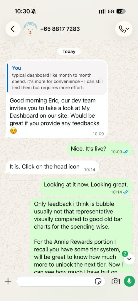
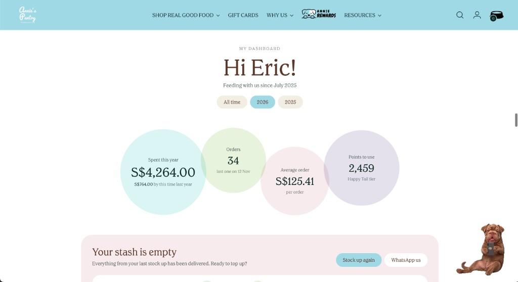
This is the top of the page.
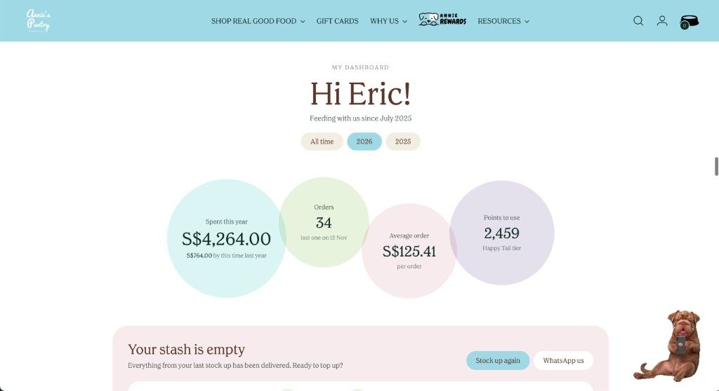
Feeding with us since July 2025. For 2026 so far, the account puts $4,264 across 34 orders on one screen, average $125.41, last order on 12 November. The same card shows $764 by this time last year, which tracks — I only started in July. Points waiting: 2,459, on the Happy Tail tier.
Then the year, month by month.
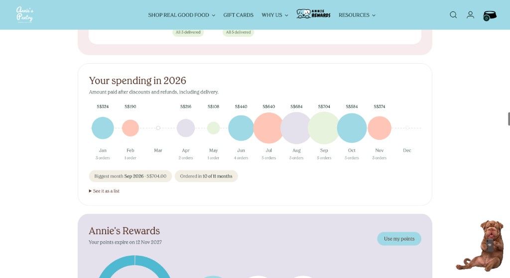
Each month carries an amount and an order count. September was the biggest month, at $704. I've ordered in 10 of the 11 months so far this year — March is the quiet one. If the chart isn't how you read numbers, there's a see it as a list option right under it. Annie's Rewards sits on the same page, including when the points expire. Mine run to 12 November 2027.
For a view that did not exist on Sunday, this is a lot of care. Year-to-date spend was the thing I kept estimating in my head. Now I don't have to.
They took the other note too
The same week, a new look landed on the site. I told them that the paw prints tiled across the background were a bit much. The products are the point. A busy paw pattern behind them made browsing slightly harder to read.
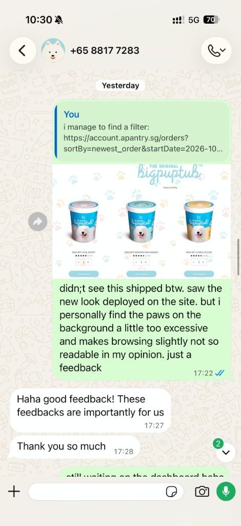
They called it good feedback, which would have been enough.
I want the sequence on the record, because it's the part that impressed me. They invited me to the dashboard, I opened it, and I sent a few more notes.
Two things I still want on that page
I told them it was looking great, and I still had two notes. They asked, so here they are.
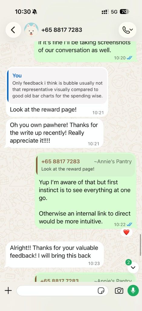
The spending view uses bubbles. Size stands in for the amount, which is friendly, and a plain bar chart is easier when you want one month against the next. Good old bars, for the spending. Not crucial but I guess I am used to looking at bar charts.
On Annie's Rewards I can see the points I have. I still can't see, on that same screen, how far the Happy Tail tier is from the next one. I know the rewards page exists — they pointed me straight at it, fairly. My first instinct on a dashboard is to see the whole picture in one go: balance, tier, and what's left to unlock. If that detail stays on the rewards page, an internal link from the card would be the intuitive version. They said they'd bring it back to the team. Given the week I've just had with them, I believe they will.
Why this won me over
The food and the delivery were already the reason I stayed. Order before 11am and it goes out the same day, weekdays 4pm to 9pm, Saturdays 12pm to 5pm, no Sundays or public holidays. When the freezer is low, that cut-off is the feature. I said as much in the raw dog food guide.
The missing piece was a clean answer to a boring question: what am I actually spending, and what have the rewards added up to? They built that answer in a few days. They asked what else belonged on the page. They followed up when it shipped, and they stayed in the conversation after I asked for more. I'm really glad they took the feedback seriously. They won me over.
If you want the same setup I use — premade tubs, same-day when you beat the cut-off — I order through this Annie's Pantry referral link. Prices are unchanged, and it supports PawWhere. Promo details also live on the Annie's Pantry page. Already a customer? I hope you like the dashboard as much as I do.
Quick answers
-
Where is My Dashboard? Sign in and click the head icon on your Annie's Pantry account.
-
What can I see there? Time as a customer, spend for the year (or all-time, or last year), order count, average order, month-by-month spend, whether your last delivery has landed, and Annie's Rewards points with an expiry date.
-
Did they build this because of a blog? They were already on a new app. I sent the dashboard note on 8 November, they passed it to the dev team on the 9th, and the page was live on the 13th. They connected me to PawWhere after the invite.
-
Anything still missing? I'd take bar charts over bubbles for spending, and a clear "how much to the next rewards tier" on the dashboard itself — or a direct link through to it.